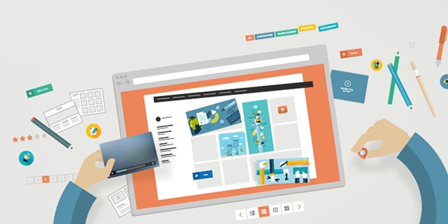
Web design is a changeable beast, which means that if those who aren’t “on-the-ball” will find themselves out of work pretty soon. But, there’s no need to panic. Here are some of the top tips and trends to watch out for in web designing in 2016.
Hover Animations
Whenever people are unaware of a particular element’s function on a site, they usually hover their cursor over it. The use of hover animations enables you to capitalize on that anticipation by providing the user with useful information, without using up too much space, and keeping things interesting at the same time.
Full Screen Forms
The human eye is naturally drawn towards movement, so how does one make the viewer focus on a single focal point. The use of full screen forms along with overlays encourages users to focus on an individual screen without getting distracted by everything else that’s going on. Using the full screen design for landing pages can also move the user towards making the purchase or procuring a service.
Using the Hero Image
Hero image is a popular term which is used in web design. The hero image is a large sized banner image that is prominently placed on the home page of a website. Since vision has a lot to do with how people react to websites, using HD hero images are one of the best way to capture the attention of an online audience. While there were certain problems in the past, the advancements made in data compression and bandwidth has made it possible for web designers to use HD hero images in their designs without having to worry about slow load times. A common use of the hero image in websites is the use of an image above the scroll which is then followed by a cards-based arrangement or zigzagging sections.
Moving Videos
All brands offer users a ‘big’ experience, and using large, prominent images have done wonders for businesses that wanted to portray just that about their services. In fact, the use of large images have also proven to be favorable for a site’s conversion rate as well, so, why not videos? The use of large moving videos on sites will prove to be big simply because it offers the same positive results for the audience. Since we, as humans are visual creatures, using moving videos is always going to be better than text and even pictures, although in some formats, pictures perform better than moving videos.
Using Easy-to-Manage CSS Layouts
Not all designs are focused towards impressing the user at an aesthetic level. Some are also impactful because they solve problems for the user as well. Using a problem-solving CSS layout such as Flexbox is key to getting a slick looking websites that performs well, leading to a much improved user experience.
Ending Note
If there is one thing that is true about design and web design in particular, it’s that it is always evolving in dynamic and new ways. This is the main reason why web designers must adjust in order to accommodate their clients, when it comes to a site’s form and function. Taking advantage of the latest trends in web designing in 2016 will ensure that you’re able to deliver the perfect user experience.

 .
.

